top of page

CATEGORY 10

Brand Identity & Brand Direction


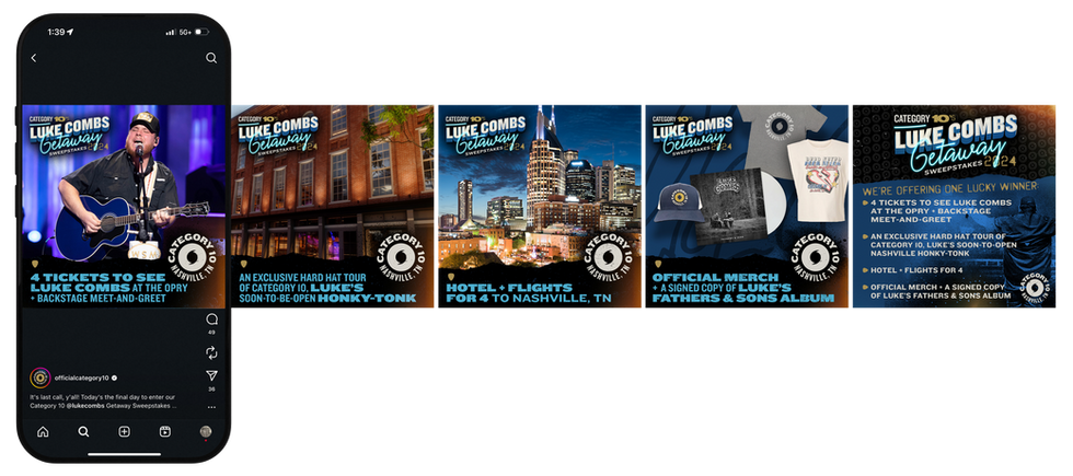
I led the brand identity work for Luke Combs’ honky-tonk, shaping a visual system that captured his full-on Category 10 energy. From early public announcements to in-bar signage, the goal was to build something bold, authentic, and grounded in the atmosphere of a real honky-tonk.

I also had the chance to visit Luke’s place and pull décor directly from his personal collection—pieces with real stories behind them. Those details helped the space feel authentic and genuine, not themed or manufactured.


The Challenge

The brand already had a strong attitude but nothing tying it together visually. They needed a premium identity that still carried the grit, warmth, and edge you expect from a honky-tonk. The system also had to scale across bottles, labels, promotional materials, and the physical space itself.


My Role & Approach

I developed a full identity system built on confident typography, a tight color palette, and visual cues drawn from classic bar signage, regional craft, and Southern heritage. The focus was on creating something straightforward and timeless—strong enough to stand on its own, but flexible enough to grow.


Execution

  • Identity system

  • Logo & secondary marks

  • Packaging & label design

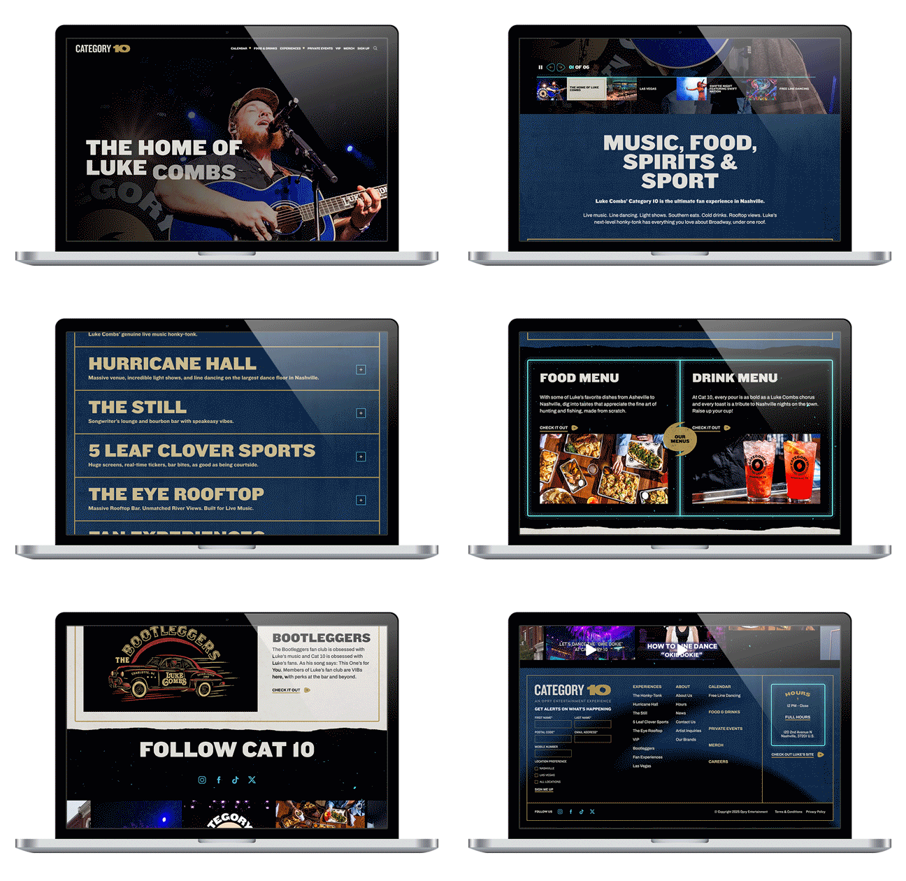
  • Print, digital, & environmental graphics

  • Merchandise & promotional items

  • Brand guidelines & production files


Impact

The final system gave Category 10 a clear, recognizable voice across every touchpoint. Eye-catching signage and thoughtful wayfinding helped shape the in-space experience, making the honky-tonk easy to navigate while reinforcing the brand throughout. The identity elevated the overall presence without losing its character, creating a solid foundation for future products, events, and expansions.

PRE-OPENING SIZZLE REEL

OEG ANNOUNCING CATEGORY 10

PRE-OPENING

NOW OPEN

CAT10_BG_1920x1080_1.jpg
bottom of page